
AI-driven, anti-diet food tracking app
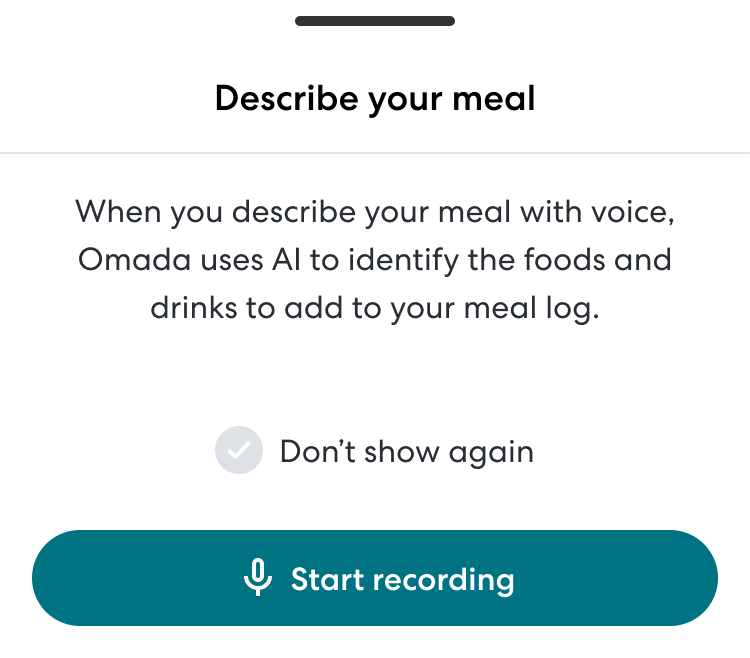
Over the course of 9 months, I redesigned the food tracker in the Omada app to modernize the information architecture and visual language, enable new tracking modalities (e.g. barcode and voice tracking), and introduce a novel framework for understanding the healthiness of your meals that focused on nutrition density and balance rather than the calories and macros that underpin most competitor apps.
impact

7% increase in daily food tracking engagement
Increase in % nutritious foods eaten

Decrease in complaints in app store reviews and satisfaction surveys
My Role
I led design from problem definition through visual design and execution. In addition to the traditional design process, I collaborated closely with clinical SMEs on prompt engineering to ensure our AI driven features generated accurate and user-centered outputs.

Where we started
The previous food tracker at Omada leveraged a full page sheet for interactions and was very limited in how you could input food, search through a small database of a couple hundred foods and add a static image.
The feature gave no feedback on how healthy a user’s meals were and no feedback on how to improve. Most users tracked one or two meals, then abandonded the feature.
Research and Problem Definition
Because we had a lot of existing research to draw from, primarily past qualitative interviews and quarterly satisfaction surveys, we were able to jump right in prioritizing problem areas. We conducted generative and evaluative research later in the process to make detailed UX/UI decisions.
Key problem areas:
- The app doesn’t help members understand if they are eating a healthy, balanced diet.
- It is tedious to log food with limited search and photo capabilities.
- The food section of the app doesn’t support feature expansion.
“
I’ve only used the tracker occasionally as I don’t feel like it changes my behavior or way of selecting food. Other tracking apps helped me stay within a target range and/or make better choices.”
Information Architecture and Wireframing
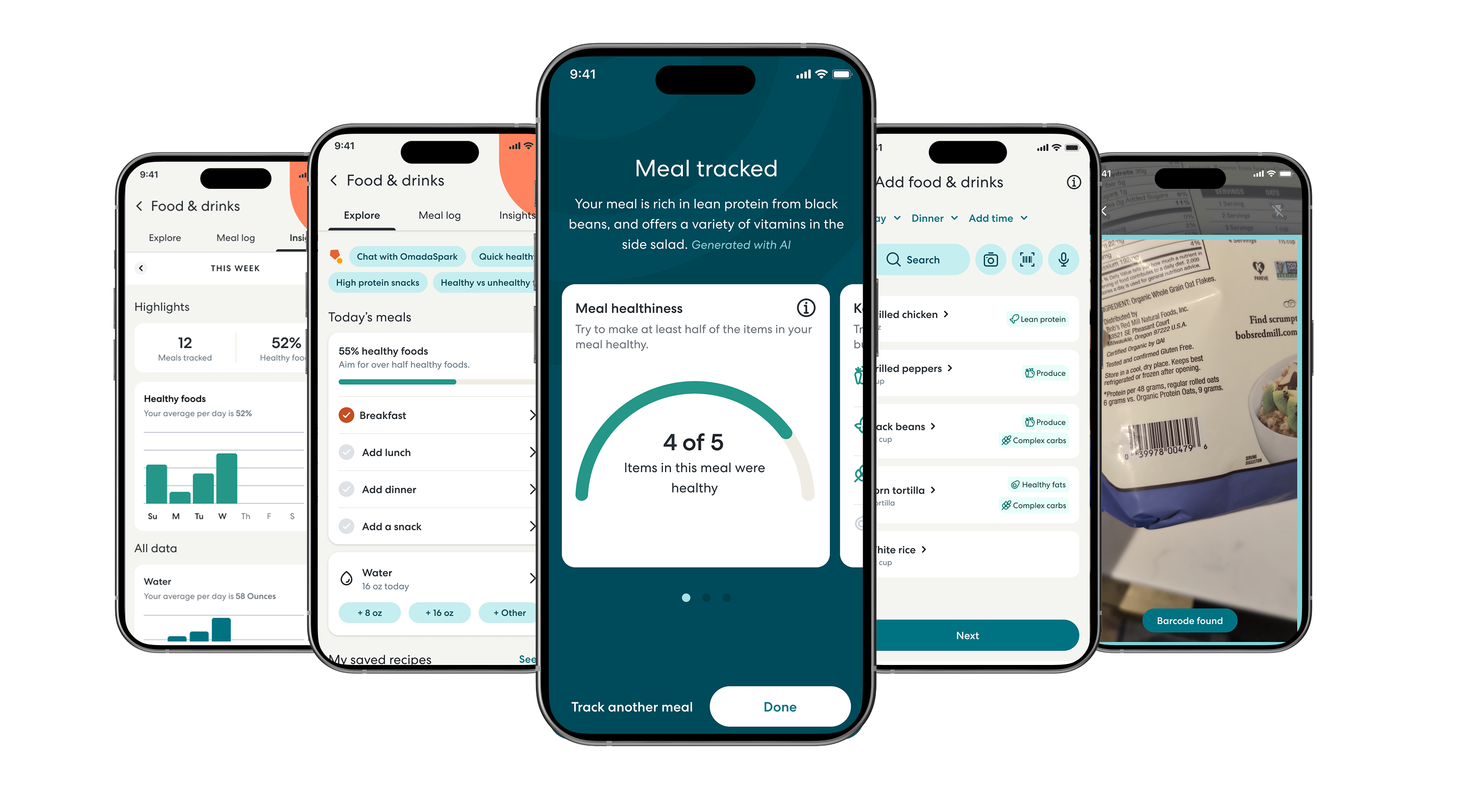
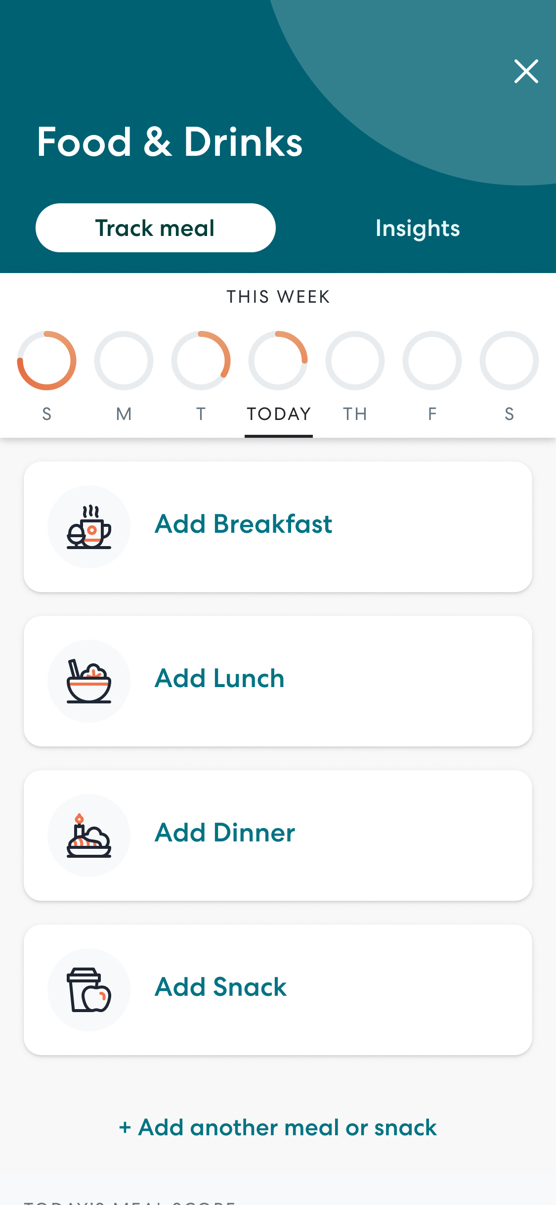
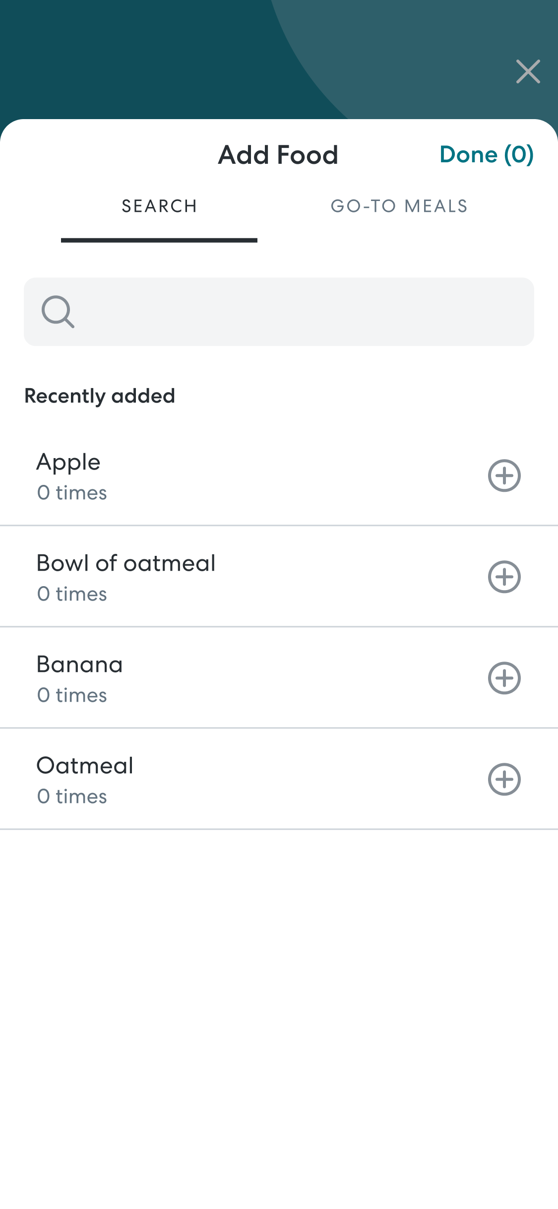
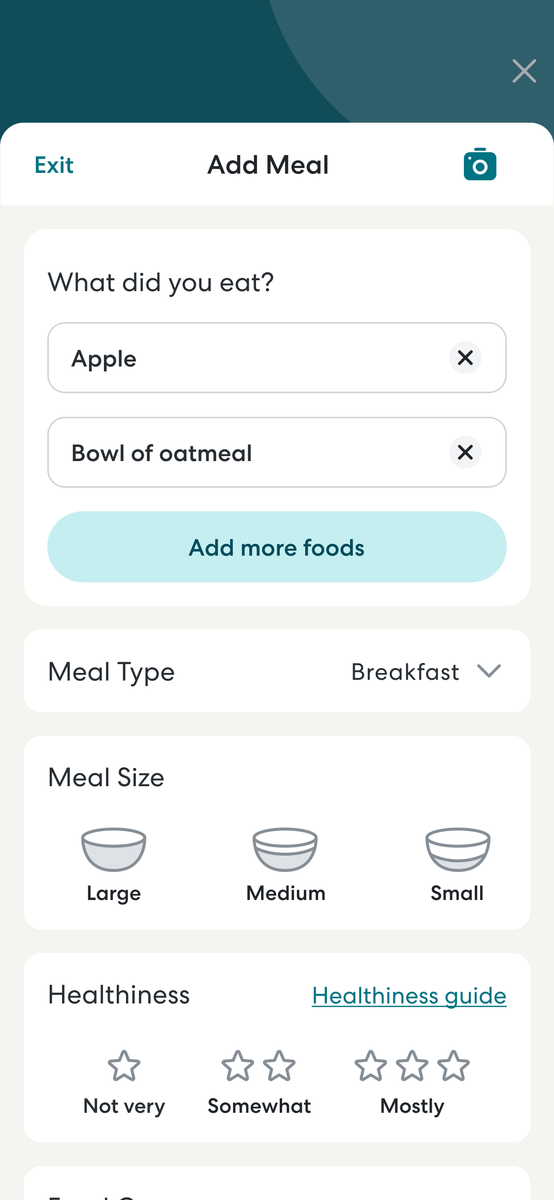
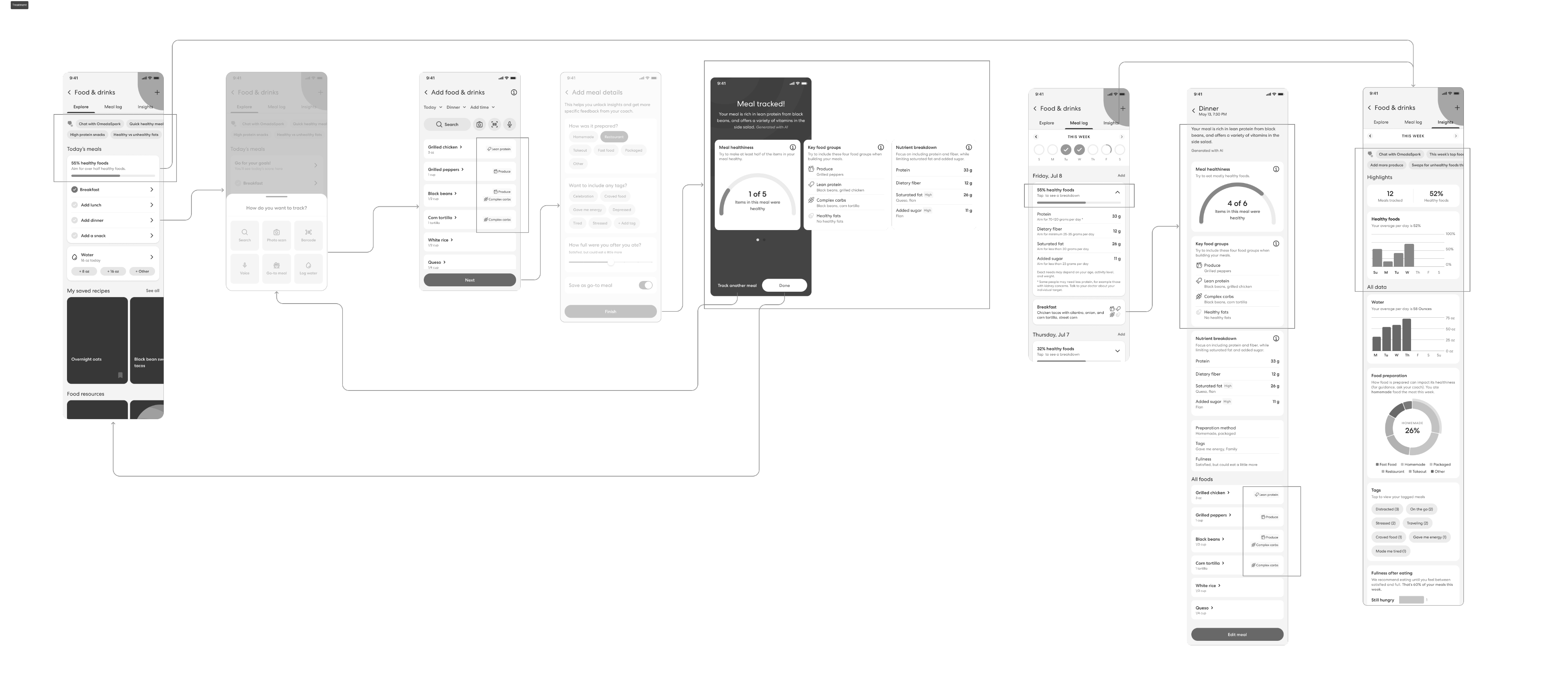
I restructured the feature from a multi-step sheet to page flow to avoid awkward UI stacking issues and make it easier to move between pages, and simplified the additional context questions we asked members to make it faster and easier to track a meal.
I also added a new tab, “Explore” that focused on your key info for the day and made space for new features like recipes and a nutrition chat bot. This framework has since been applied to other areas of the application to improve cohesion, usability, and scalability.
Defining a Healthiness framework
The most unique and challenging part of this redesign was developing a new framework for measuring and tracking the nutritional quality of meals over time. Most competitors use calories, macros, or a red light/green light system, all of which can contribute to unhealthy relationships with food, restrictive eating, or “cheating the system” with low calorie, low nutrition foods.
To define a new framework, I worked closely with a registered dietitian to explore ways to encourage eating highly nutritious, balanced meals without making foods feel off limits or exacerbating the all-or-nothing thinking our most vulnerable users struggled with.
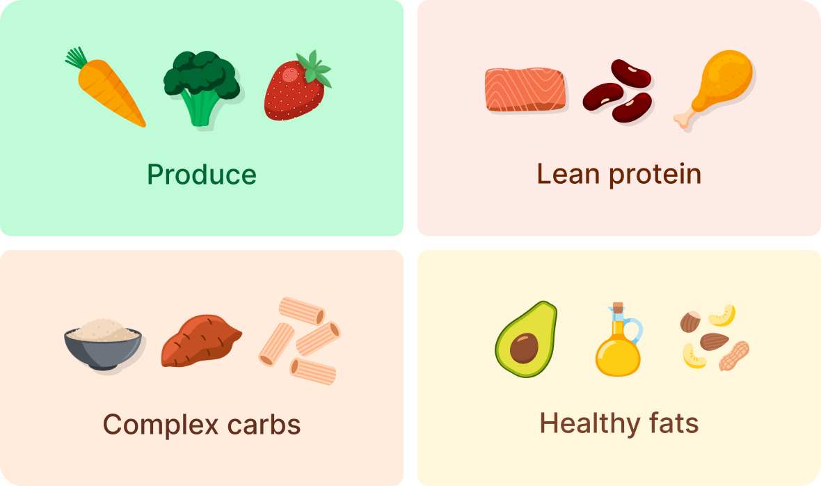
We explored several options, gathered feedback from expert stakeholders and users, and landed on a system that focused on including four healthy food groups with each meal: produce, lean protein, complex carbs, and healthy fats.
Prompt Engineering
To implement the newly defined framework, we used generative AI to classify foods and generate feedback on what users were doing well and how they could improve the healthiness of their foods.
I collaborated closely with my clinical SME to engineer multiple prompts to drive these features and ensure the outputs were clinically accurate, met our internal voice and tone guidelines, and addressed user’s need for actionable feedback on their meals.
You are a nutrition expert who helps people eat healthier meals by giving positive feedback and suggesting ways to improve.
Each meal should include items from each of these four food groups: Produce (fruits and vegetables), Lean protein (chicken, fish, beans, lean dairy), complex carbs (whole grains and starchy vegetables), and healthy fats (nuts, olive oil, avocado. Given an input meal, generate a 1 sentence summary that highlights...
Not the actual prompt, lol
Visual Design
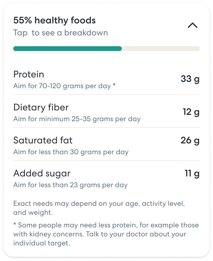
I worked with an existing design system to ensure cohesion across the Omada app, while introducing key new components for this feature: new graphs and charts, additional interaction patterns for sheets, and key information pages that leveraged an inverted color pallet and brand shapes to differentiate from the core app flows. I also designed micro-animations for the key feedback screen to give the app polish and introduce a moment of delight when a user’s meal was made up of at least 50% high nutrition density foods.
We did not have a design system team at the time of this project, so I contributed the new components to our Figma library and socialized their usage across our product design team so they could be leveraged in other areas.
AI-driven, anti-diet food tracking app
Over the course of 9 months, I redesigned the food tracker in the Omada app to modernize the information architecture and visual language, enable new tracking modalities (e.g. barcode and voice tracking), and introduce a novel framework for understanding the healthiness of your meals that focused on nutrition density and balance rather than the calories and macros that underpin most competitor apps.
impact
7% increase in daily food tracking engagement
Increase in % nutritious foods eaten
Decrease in complaints in app store reviews and satisfaction surveys
My Role
I led design from problem definition through visual design and execution. In addition to the traditional design process, I collaborated closely with clinical SMEs on prompt engineering to ensure our AI driven features generated accurate and user-centered outputs.

Where we started
The previous food tracker at Omada leveraged a full page sheet for interactions and was very limited in how you could input food, search through a small database of a couple hundred foods and add a static image.
The feature gave no feedback on how healthy a user’s meals were and no feedback on how to improve. Most users tracked one or two meals, then abandonded the feature.
Research and Problem Definition
Because we had a lot of existing research to draw from, primarily past qualitative interviews and quarterly satisfaction surveys, we were able to jump right in prioritizing problem areas. We conducted generative and evaluative research later in the process to make detailed UX/UI decisions.
Key problem areas:
- The app doesn’t help members understand if they are eating a healthy, balanced diet.
- It is tedious to log food with limited search and photo capabilities.
- The food section of the app doesn’t support feature expansion.
“
I’ve only used the tracker occasionally as I don’t feel like it changes my behavior or way of selecting food. Other tracking apps helped me stay within a target range and/or make better choices.”
Information Architecture and Wireframing
I restructured the feature from a multi-step sheet to page flow to avoid awkward UI stacking issues and make it easier to move between pages, and simplified the additional context questions we asked members to make it faster and easier to track a meal.
I also added a new tab, “Explore” that focused on your key info for the day and made space for new features like recipes and a nutrition chat bot. This framework has since been applied to other areas of the application to improve cohesion, usability, and scalability.
Defining a Healthiness framework
The most unique and challenging part of this redesign was developing a new framework for measuring and tracking the nutritional quality of meals over time. Most competitors use calories, macros, or a red light/green light system, all of which can contribute to unhealthy relationships with food, restrictive eating, or “cheating the system” with low calorie, low nutrition foods.
To define a new framework, I worked closely with a registered dietitian to explore ways to encourage eating highly nutritious, balanced meals without making foods feel off limits or exacerbating the all-or-nothing thinking our most vulnerable users struggled with.
We explored several options, gathered feedback from expert stakeholders and users, and landed on a system that focused on including four healthy food groups with each meal: produce, lean protein, complex carbs, and healthy fats.
Prompt Engineering
To implement the newly defined framework, we used generative AI to classify foods and generate feedback on what users were doing well and how they could improve the healthiness of their foods.
I collaborated closely with my clinical SME to engineer multiple prompts to drive these features and ensure the outputs were clinically accurate, met our internal voice and tone guidelines, and addressed user’s need for actionable feedback on their meals.
You are a nutrition expert who helps people eat healthier meals by giving positive feedback and suggesting ways to improve.
Each meal should include items from each of these four food groups: Produce (fruits and vegetables), Lean protein (chicken, fish, beans, lean dairy), complex carbs (whole grains and starchy vegetables), and healthy fats (nuts, olive oil, avocado. Given an input meal, generate a 1 sentence summary that highlights...
Not the actual prompt, lol
Visual Design
I worked with an existing design system to ensure cohesion across the Omada app, while introducing key new components for this feature: new graphs and charts, additional interaction patterns for sheets, and key information pages that leveraged an inverted color pallet and brand shapes to differentiate from the core app flows. I also designed micro-animations for the key feedback screen to give the app polish and introduce a moment of delight when a user’s meal was made up of at least 50% high nutrition density foods.
We did not have a design system team at the time of this project, so I contributed the new components to our Figma library and socialized their usage across our product design team so they could be leveraged in other areas.
AI-driven, anti-diet food tracking app
Over the course of 9 months, I redesigned the food tracker in the Omada app to modernize the information architecture and visual language, enable new tracking modalities (e.g. barcode and voice tracking), and introduce a novel framework for understanding the healthiness of your meals that focused on nutrition density and balance rather than the calories and macros that underpin most competitor apps.
impact
7% increase in daily food tracking engagement
Increase in % nutritious foods eaten
Decrease in complaints in app store reviews and satisfaction surveys
My Role
I led design from problem definition through visual design and execution. In addition to the traditional design process, I collaborated closely with clinical SMEs on prompt engineering to ensure our AI driven features generated accurate and user-centered outputs.

Where we started
The previous food tracker at Omada leveraged a full page sheet for interactions and had very limited food input options—search through a small database of a couple hundred foods and add a static image.
The feature gave no feedback on how healthy a user’s meals were and no feedback on how to improve. Most users tracked a couple meals, then abandoned the feature.
Research and Problem Definition
Because we had a lot of existing research to draw from, primarily past qualitative interviews and quarterly satisfaction surveys, we were able to jump right in prioritizing problem areas. We conducted generative and evaluative research later in the process to make detailed UX/UI decisions.
Key problem areas:
- The app doesn’t help members understand if they are eating a healthy, balanced diet.
- It is tedious to log food with limited search and photo capabilities.
- The food section of the app doesn’t support feature expansion.
“
I’ve only used the tracker occasionally as I don’t feel like it changes my behavior or way of selecting food. Other tracking apps helped me stay within a target range and/or make better choices.”
Information Architecture and Wireframing
I restructured the feature from a multi-step sheet to page flow to avoid awkward UI stacking issues and make it easier to move between pages, and simplified the additional context questions we asked members to make it faster and easier to track a meal.
I also added a new tab, “Explore” that focused on your key info for the day and made space for new features like recipes and a nutrition chat bot. This framework has since been applied to other areas of the application to improve cohesion, usability, and scalability.
Defining a Healthiness framework
The most unique and challenging part of this redesign was developing a new framework for measuring and tracking the nutritional quality of meals over time. Most competitors use calories, macros, or a red light/green light system, all of which can contribute to unhealthy relationships with food, restrictive eating, or “cheating the system” with low calorie, low nutrition foods.
To define a new framework, I worked closely with a registered dietitian to explore ways to encourage eating highly nutritious, balanced meals without making foods feel off limits or exacerbating the all-or-nothing thinking our most vulnerable users struggled with.
We explored several options, gathered feedback from expert stakeholders and users, and landed on a system that focused on including four healthy food groups with each meal: produce, lean protein, complex carbs, and healthy fats.
Prompt Engineering
To implement the newly defined framework, we used generative AI to classify foods and generate feedback on what users were doing well and how they could improve the healthiness of their foods.
I collaborated closely with my clinical SME to engineer multiple prompts to drive these features and ensure the outputs were clinically accurate, met our internal voice and tone guidelines, and addressed user’s need for actionable feedback on their meals.
You are a nutrition expert who helps people eat healthier meals by giving positive feedback and suggesting ways to improve.
Each meal should include items from each of these four food groups: Produce (fruits and vegetables), Lean protein (chicken, fish, beans, lean dairy), complex carbs (whole grains and starchy vegetables), and healthy fats (nuts, olive oil, avocado. Given an input meal, generate a 1 sentence summary that highlights...
Not the actual prompt, lol
Visual Design
I worked with an existing design system to ensure cohesion across the Omada app, while introducing key new components for this feature: new graphs and charts, additional interaction patterns for sheets, and key information pages that leveraged an inverted color pallet and brand shapes to differentiate from the core app flows. I also designed micro-animations for the key feedback screen to give the app polish and introduce a moment of delight when a user’s meal was made up of at least 50% high nutrition density foods.
We did not have a design system team at the time of this project, so I contributed the new components to our Figma library and socialized their usage across our product design team so they could be leveraged in other areas.